Every designer has that one thing that makes them cringe.
For some, it’s stretched logos. For others, it’s walls of tiny text, flashing animations, or websites that still autoplay music the second they load.
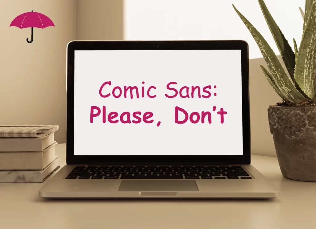
For us? It’s Comic Sans.
Now before anyone accuses us of being typography snobs, hear us out.
Comic Sans isn’t evil. It wasn’t created by a villain plotting to destroy good design. In fact, it was originally designed with good intentions. Back in 1994, Microsoft developer Vincent Connare created Comic Sans to mimic the lettering found in comic books and make certain software interfaces feel more approachable and friendly.
The problem is that what started as a niche font for a specific purpose somehow escaped into the wild and began appearing absolutely everywhere. School newsletters. Church bulletins. Business cards. Restaurant menus. Corporate presentations. Marketing materials. Websites.
And somehow, more than 30 years later, we’re still having conversations about whether Comic Sans belongs on business websites.
The answer is no.
Not because designers say so. Not because it’s trendy to hate Comic Sans. And not because there aren’t situations where a playful font can work.
The answer is no because typography matters more than most people realize.
Your fonts communicate just as much as your words do. The typeface you choose tells visitors whether you’re professional, trustworthy, modern, creative, established, playful, sophisticated, or completely out of touch. Before someone reads your headline, your service descriptions, or your call-to-action, they’ve already formed an opinion based on what they see.
And Comic Sans isn’t helping.
Why Fonts Matter More Than Most Business Owners Think
When most people think about branding, they think about logos.
The logo gets all the attention. It’s the star of the show. Businesses spend weeks debating colors, icons, layouts, and taglines.
Meanwhile, the fonts often get selected almost as an afterthought.
That can be a costly mistake.
Typography plays a huge role in how users experience your website. Every page, every headline, every button, and every paragraph relies on typography to guide visitors through your content. Fonts influence readability, usability, trust, and overall perception.
Think about it this way. If you were looking for a financial advisor and landed on a website that used Comic Sans throughout its pages, how would you feel?
You might not immediately identify the font as the problem. Instead, you’d simply feel that something seems off. The site may appear less polished, less credible, or less professional than its competitors.
The same thing happens for law firms, healthcare providers, consultants, contractors, nonprofits, and nearly every other type of organization.
People make judgments quickly. Studies have repeatedly shown that website visitors form impressions within seconds. Design choices influence whether someone stays on a website, explores additional pages, or leaves altogether.
Typography is a major part of that first impression.
The Real Problem with Comic Sans
The biggest issue with Comic Sans isn’t that it’s ugly.
That’s subjective.
The real issue is that it communicates the wrong message in most professional settings.
Comic Sans feels informal. It feels playful. It feels childlike.
If you’re promoting a summer camp, a children’s birthday party, or a comic book club, that may be perfectly appropriate.
But most businesses aren’t trying to project those qualities.
A law office wants to communicate trust and expertise.
A medical practice wants to communicate professionalism and care.
A financial advisor wants to communicate confidence and reliability.
A contractor wants to communicate quality workmanship and attention to detail.
Comic Sans works against all of those goals.
Imagine showing up to a job interview wearing pajamas. There’s nothing inherently wrong with pajamas. They’re comfortable. They’re useful. They serve a purpose.
But they’re not appropriate for that particular situation.
Comic Sans has the same problem.
It’s not that the font itself is evil. It’s that it rarely fits the environment where people try to use it.
What Comic Sans Says About Your Website
Whether we like it or not, visual design creates expectations. When someone lands on a business website, they start forming opinions almost immediately based on what they see—not just what they read.
When Comic Sans shows up in that context, it can trigger a few quick assumptions. Visitors may think the website feels outdated, that the business isn’t paying close attention to design, or that the company may not be fully invested in maintaining a modern, professional online presence. In some cases, it can even raise questions about whether the products or services are just as outdated as the website itself.
Those assumptions aren’t always fair, but they are real. People make snap judgments based on visual cues all the time, often without realizing it.
That’s why every design choice matters. Fonts, colors, imagery, spacing, and layout all work together to tell a story about your brand before a visitor ever reaches your content.
And unfortunately, Comic Sans tends to tell a story most businesses would rather avoid.
The Impact on User Experience

At Raney Day Design, we spend a lot of time talking about user experience.
Good user experience isn’t just about making a website look nice. It’s about helping visitors quickly find information, understand your message, and take action.
Typography plays a major role in that process.
Strong website fonts create hierarchy. They help users understand which content is most important. They make headlines stand out. They improve readability. They create consistency across the entire site.
Comic Sans struggles in many of these areas because of its irregular, handwritten appearance. It can make content feel cluttered and less organized, particularly on modern websites where clean, structured layouts are expected.
When users have to work harder to read content or navigate information, engagement suffers.
And when engagement suffers, conversions often suffer too.
But Isn’t Comic Sans Friendly?
Absolutely.
That’s one reason people continue to use it.
The problem is that we’re no longer limited to the font choices available in 1994.
Today’s designers have access to thousands of fonts that are both friendly and professional.
You don’t have to choose between approachable and credible.
Fonts like Nunito, Poppins, Montserrat, Open Sans, Lato, and Raleway can create a welcoming feel without sacrificing professionalism. They offer clean lines, excellent readability, and modern aesthetics while still feeling warm and inviting.
That’s why you’ll see these fonts used on countless successful business websites.
They’re approachable without being childish.
They’re friendly without looking unprofessional.
They’re modern without feeling cold.
In other words, they accomplish what many people hope Comic Sans will accomplish—just much more effectively.
What Good Typography Actually Looks Like
Great typography often goes unnoticed—and that’s usually because it’s doing its job well.
When it works, visitors aren’t thinking about fonts at all. They’re reading, scanning headlines, navigating pages, and finding what they need without friction. Good typography supports the experience instead of distracting from it.
Strong typography feels intentional. Headlines should clearly stand apart from body text, paragraphs should be easy to read on any device, and fonts should reflect the brand’s personality and goals.
Different industries naturally call for different styles. Luxury brands often lean toward elegant serif fonts for sophistication, while tech companies favor clean sans-serif fonts for a modern, efficient feel. Creative agencies may choose bolder typography to showcase personality and originality.
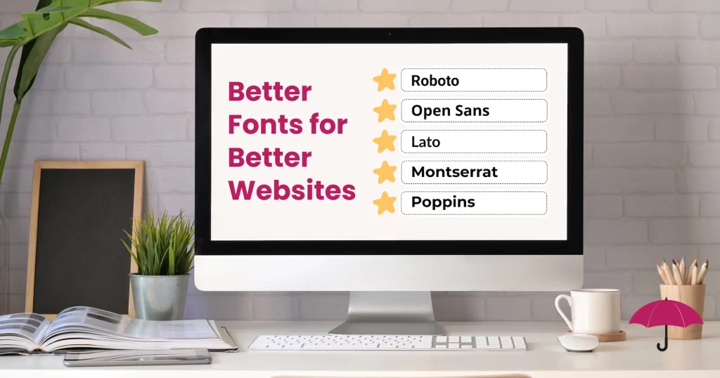
In WordPress website design, a few fonts consistently stand out for their balance of style and usability: Roboto, Open Sans, Lato, Montserrat, and Poppins. These typefaces are popular because they’re readable, versatile, and work well across devices.
Each serves a purpose. Roboto and Open Sans are highly clean and flexible. Lato feels slightly warmer while staying professional. Montserrat works well for strong headlines, and Poppins offers a modern, geometric style suited for contemporary brands.
When typography is done well, it becomes part of the brand experience rather than a distraction. It supports the message instead of competing with it.
Comic Sans, on the other hand, rarely achieves that balance. It tends to pull attention away from the content itself.
And when visitors are focused on the font, they’re not focused on your business.
Why This Matters for WordPress Websites
One of the reasons we love building websites with WordPress is the incredible flexibility it offers.
Business owners have access to thousands of fonts and customization options. Creating a professional, branded experience has never been easier.
The challenge is knowing which choices support your goals and which choices undermine them.
Just because a font exists doesn’t mean it belongs on your website.
WordPress gives you the freedom to choose from an enormous library of typography options, but successful design requires strategy. Every visual decision should support your brand, strengthen credibility, and improve the user experience.
That’s why professional website design goes far beyond selecting colors and plugging in content.
It’s about creating a cohesive digital experience that reflects who you are and builds trust with your audience.
Typography is a surprisingly important piece of that puzzle.
The Kindergarten Fundraiser Exception

Now let’s address the obvious question.
What about that kindergarten fundraiser flyer?
Surely Comic Sans belongs there, right?
Maybe.
Honestly, if you’re organizing a school carnival, promoting a children’s event, or creating materials specifically for young kids, Comic Sans is far less offensive. Its playful appearance may actually fit the audience and purpose.
But even then, there are usually better options available.
Modern fonts can be fun, engaging, and kid-friendly without carrying decades of design baggage.
So while we’ll reluctantly allow Comic Sans a temporary hall pass for the occasional elementary school event, we still wouldn’t recommend making it your go-to font choice.
Especially not for your business.
The Bigger Lesson: Every Design Choice Matters
At the end of the day, this isn’t really a blog about Comic Sans.
It’s a blog about intentional design.
Every element of your website contributes to how visitors perceive your brand. Your typography, imagery, colors, messaging, navigation, and layout all work together to create an experience.
When those elements align, visitors feel confident in your business.
When they don’t, trust begins to erode.
The good news is that small improvements can make a big difference. Choosing better fonts won’t magically transform your business overnight, but it can strengthen your brand, improve readability, and create a more professional online presence.
And that’s exactly what good web design is supposed to do.
So the next time you’re tempted to use Comic Sans on your website, ask yourself one simple question:
What message am I trying to send?
If the answer is professional, trustworthy, modern, credible, or polished, there are far better options waiting for you.
And if you’re not sure which typography choices best fit your brand, we’d be happy to help.
Let’s take a look at your website together. Schedule a strategy call today and don’t worry, we’ll keep the Comic Sans jokes to a minimum.